2021
Design • Branding • Artwork digitization + Color correction • Translation • AR Typography
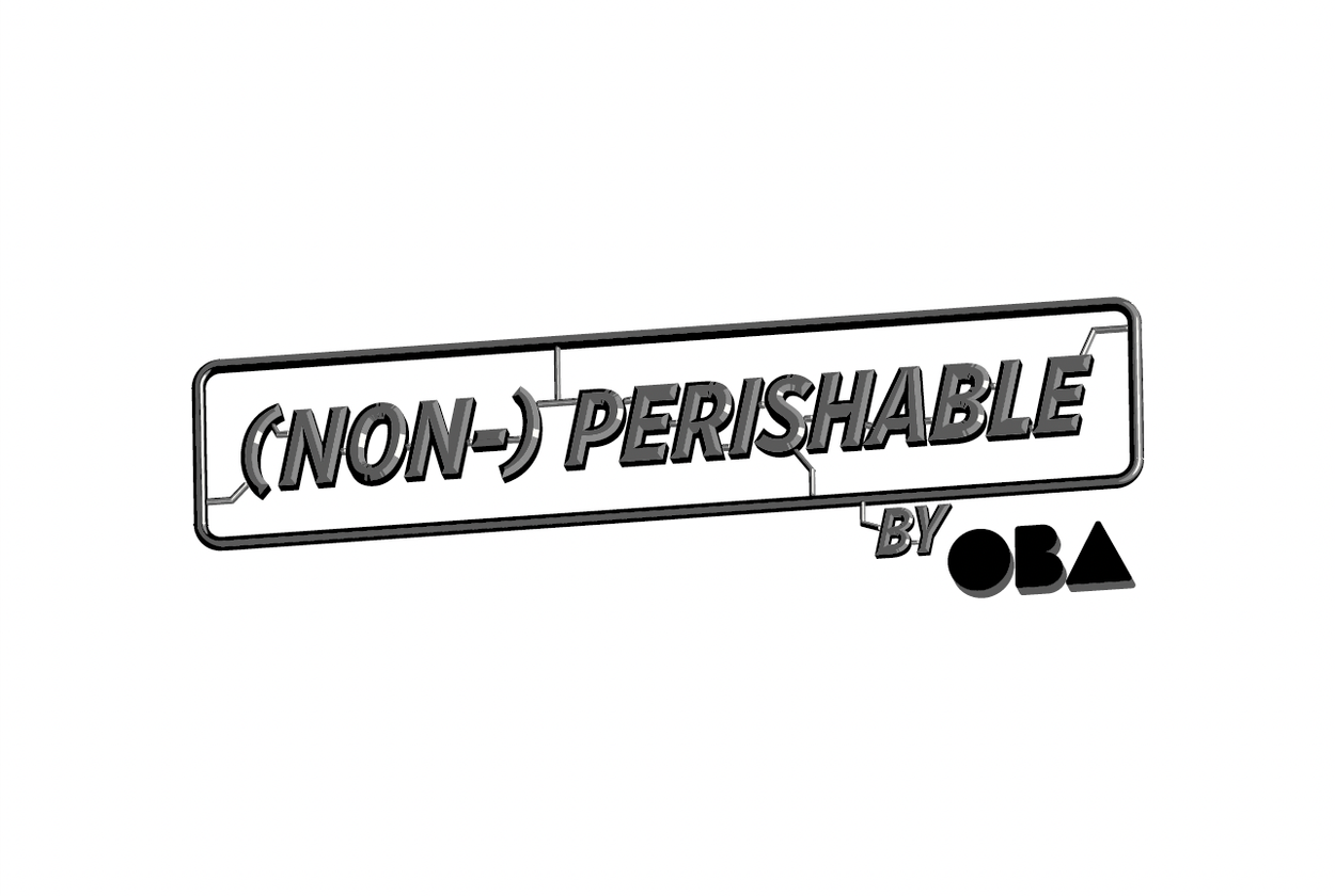
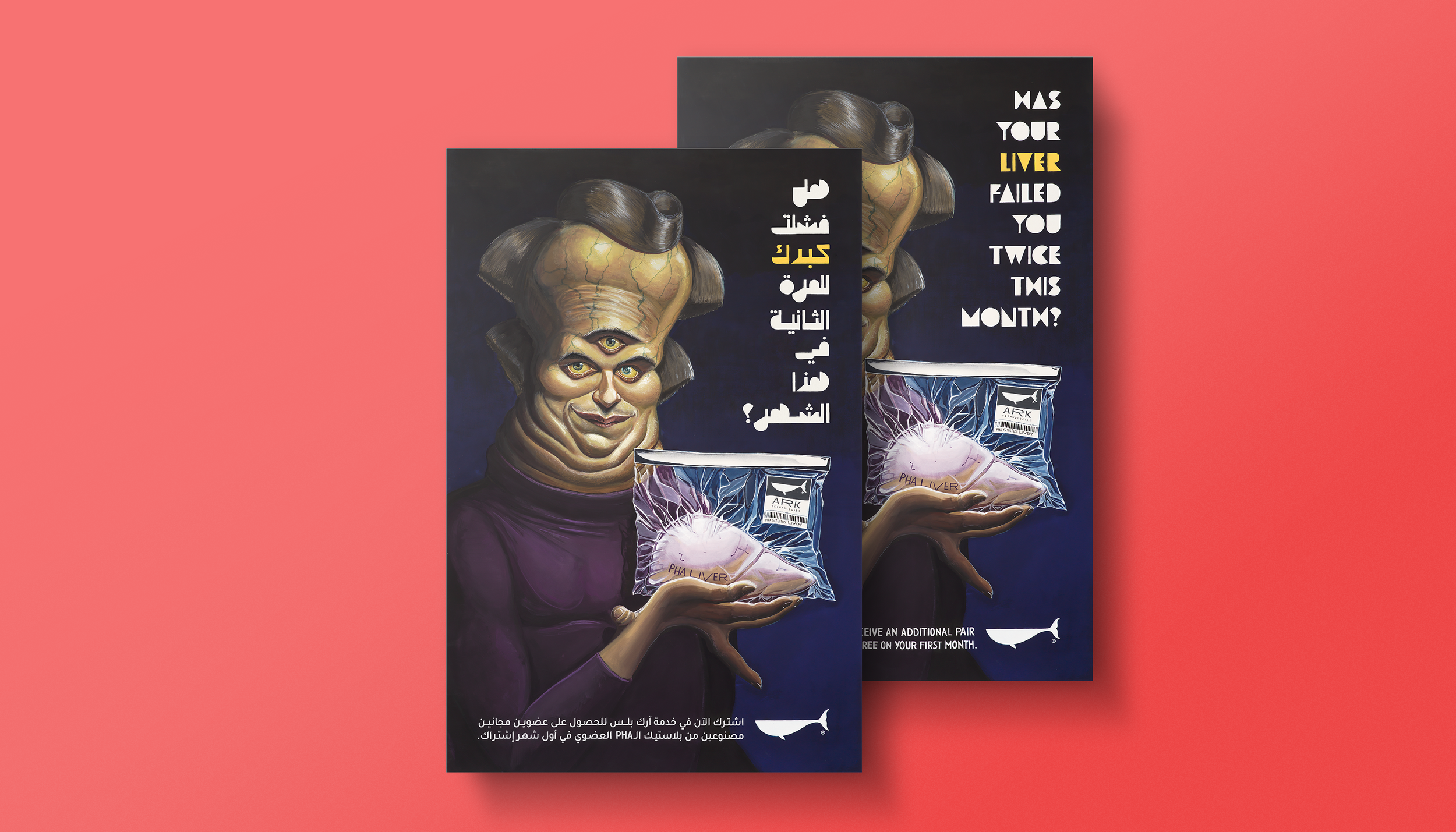
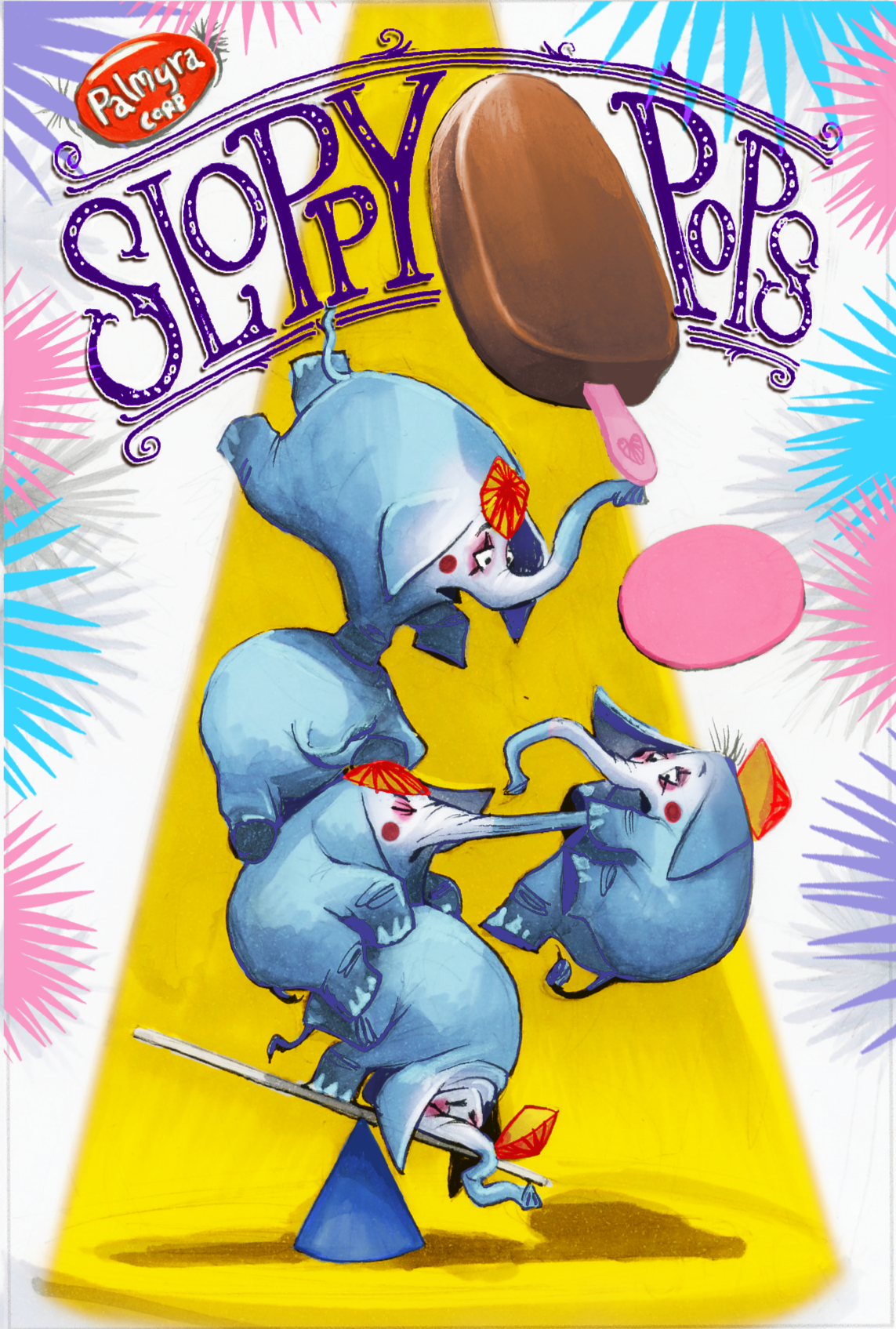
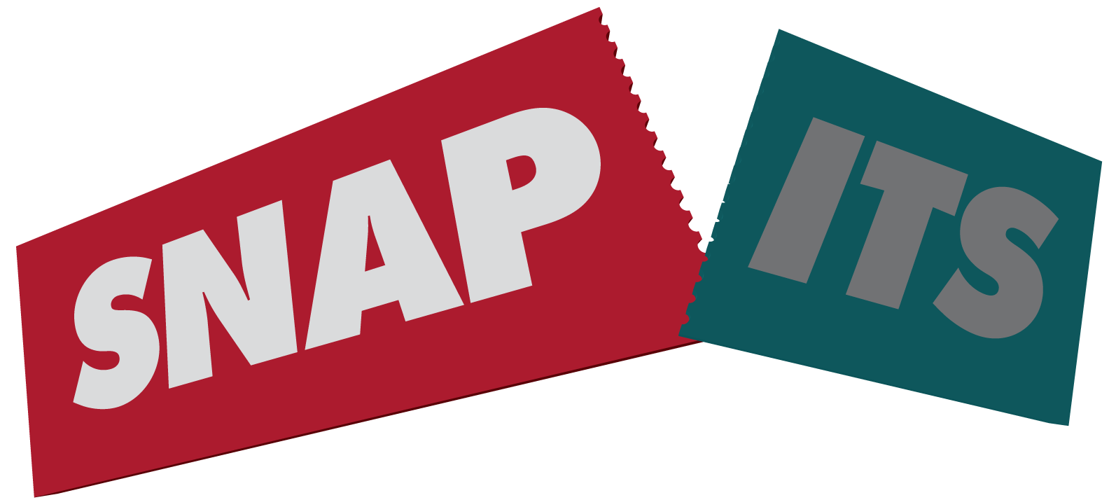
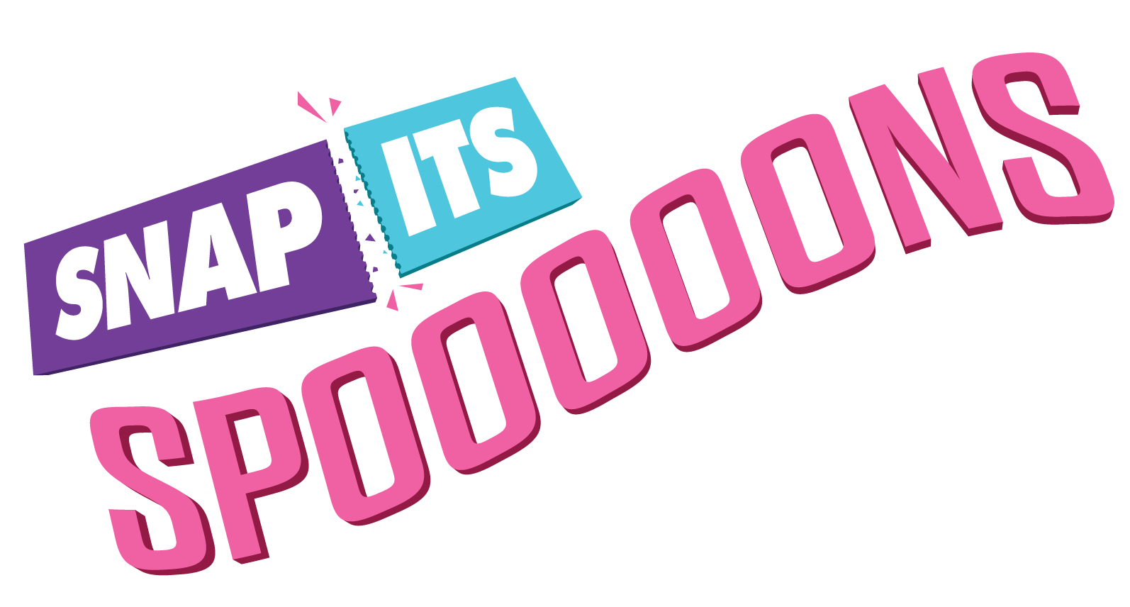
(Non-)Perishable is a series that began as a collection of paintings resembling advertising posters, challenging consumerist habits and critiquing unsustainable practices, particularly the pervasive use of plastics. The series’ typographic logo draws inspiration from plastic injection molds, a process used to create detailed, inexpensive plastic toys that are sometimes sold in their original mold trees for consumers to assemble.
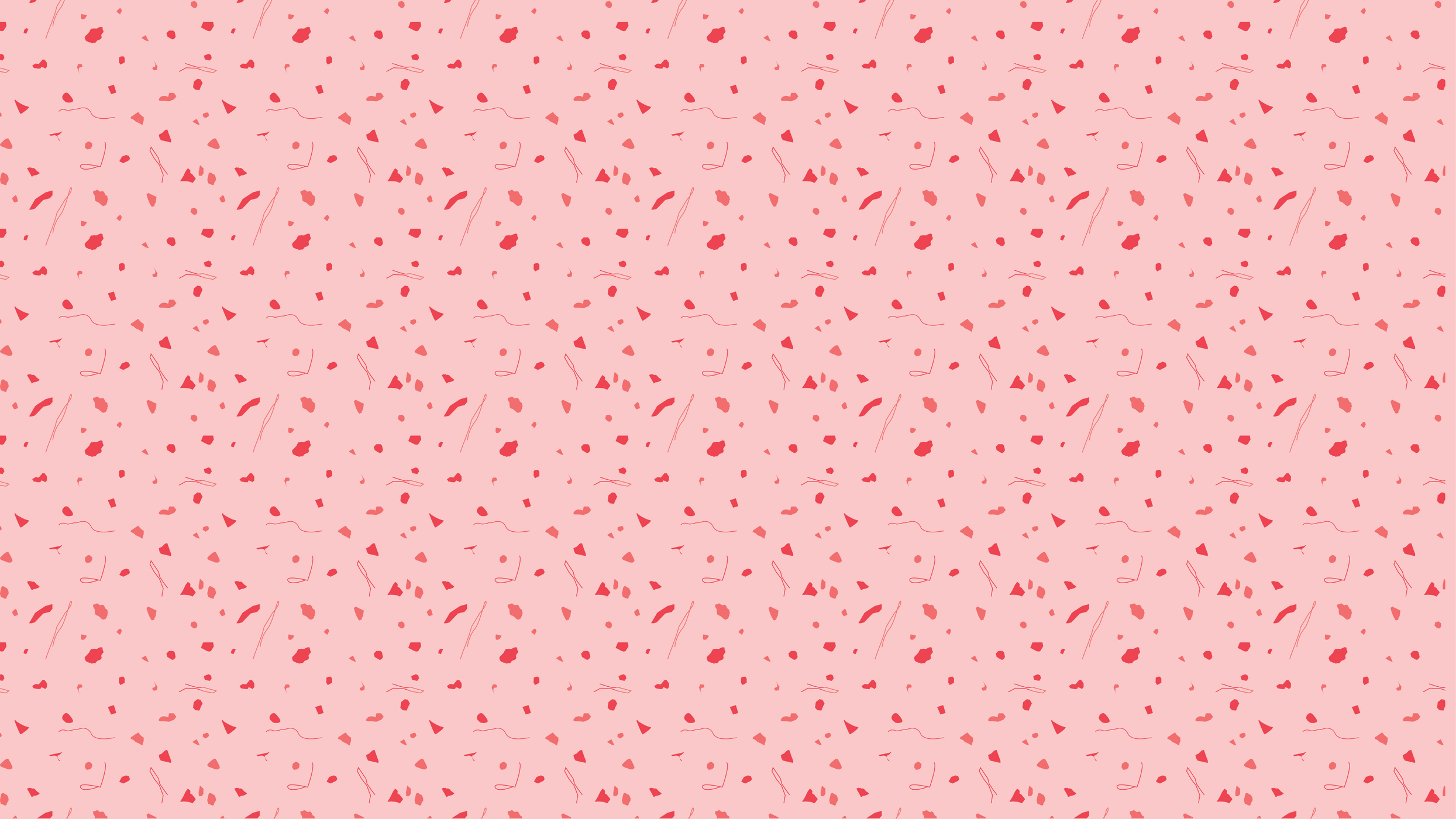
The logo is intentionally designed to reflect the enduring nature of plastics, which break down into microplastics that persist in the environment for hundreds of years. This concept is further echoed in the branding, where a decorative pattern of various microplastics is integrated into the tissue paper used inside the series’ packaging. The color scheme aligns with the visual identity of my studio, OBA.
The series blends multiple design disciplines, incorporating logo design, package design, English and Arabic typography, and thoughtful production techniques to create a cohesive and meaningful commentary on sustainability and consumer culture.
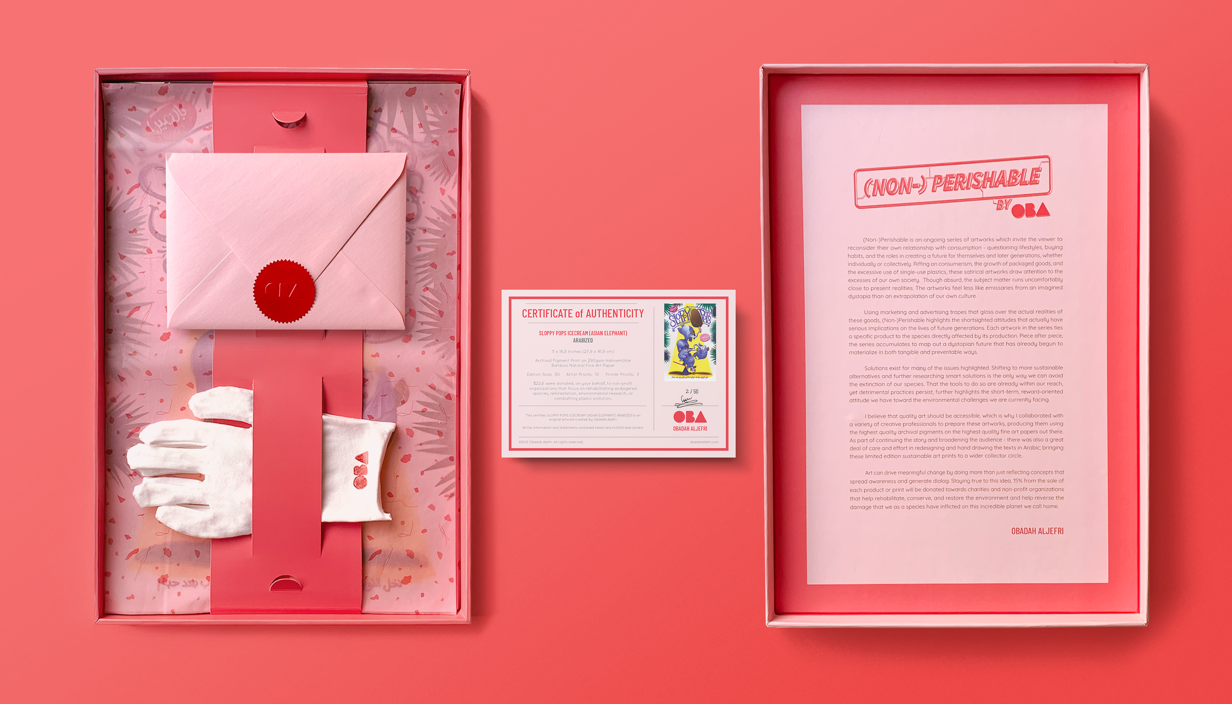
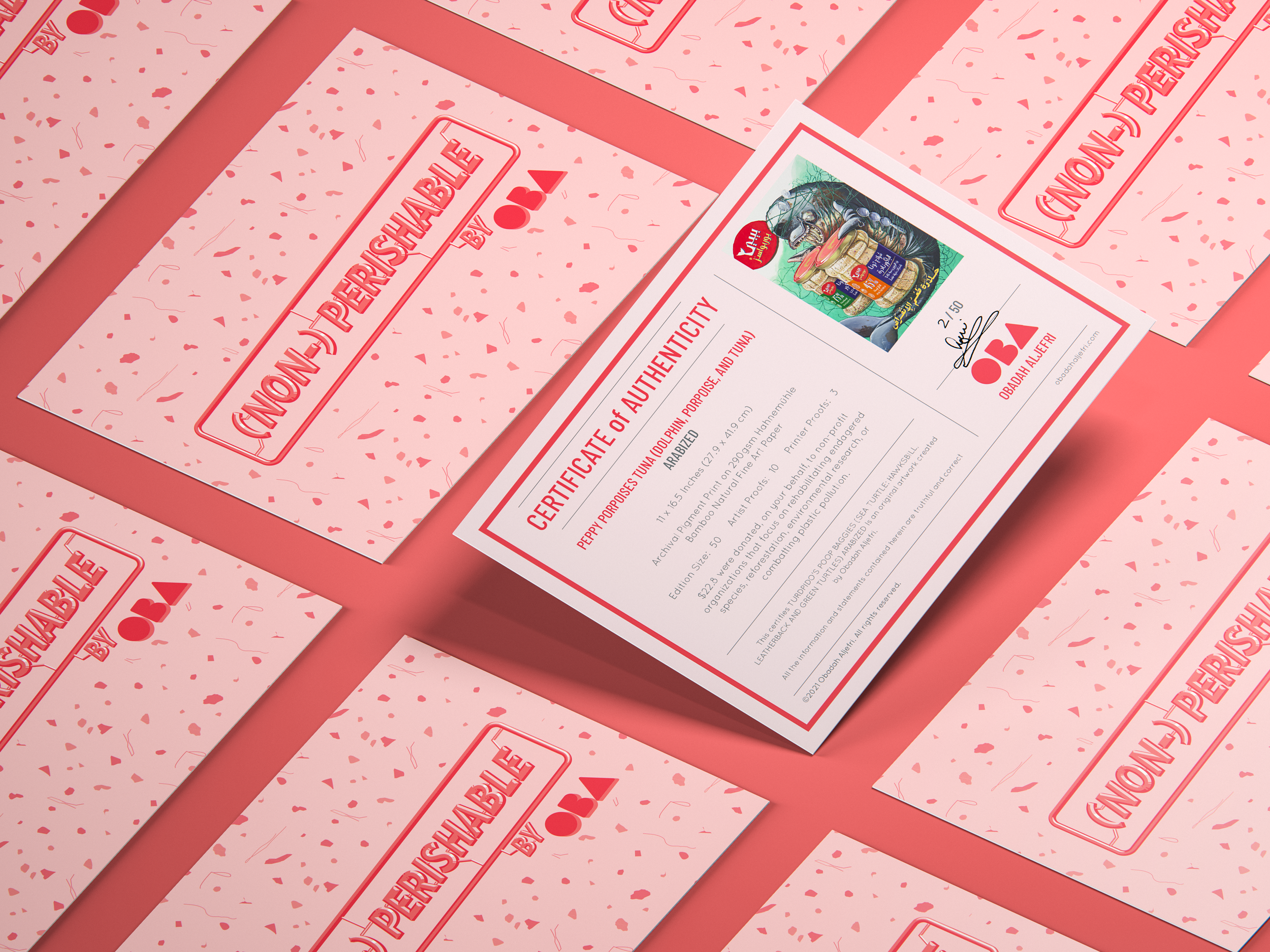
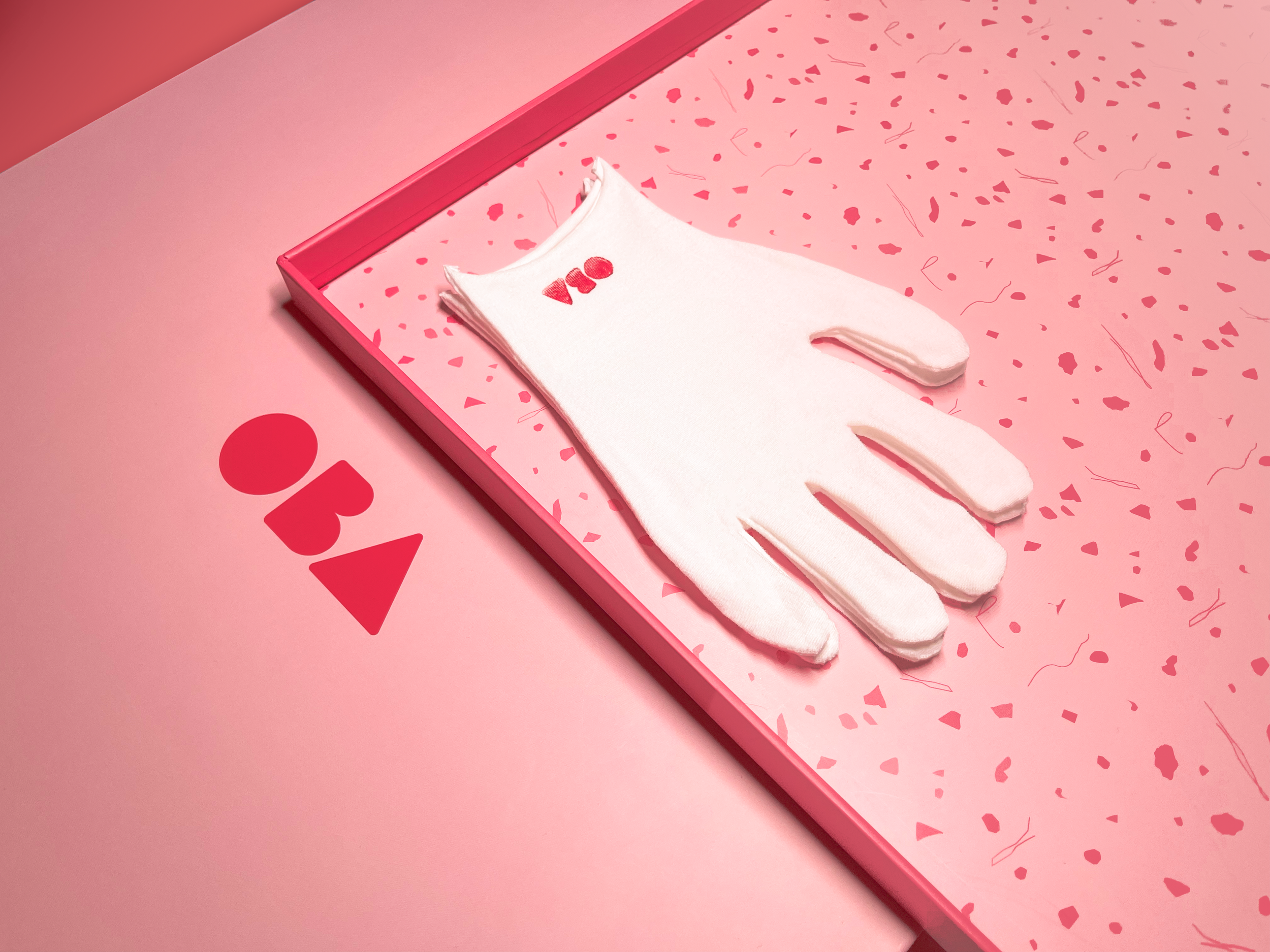
Each box is carefully packed with art prints separated by custom tissue paper and slotted into a sleeve. Inside the sleeve: an envelope containing hand-signed certificates of authenticity sealed with an embossed red foil sticker, and a gentle cotton glove with my logo hand printed on each glove for handling the prints during framing or installation.
A terrazzo pattern designed from microscopic images of microplastics serves as a supporting design element, lining the inside of the box and printed on the tissue paper.
To bring quality art to a wider collector circle, I collaborated with creative professionals to produce these limited edition prints using archival pigments on Hahnemühle bamboo fine art paper, the highest quality materials available.
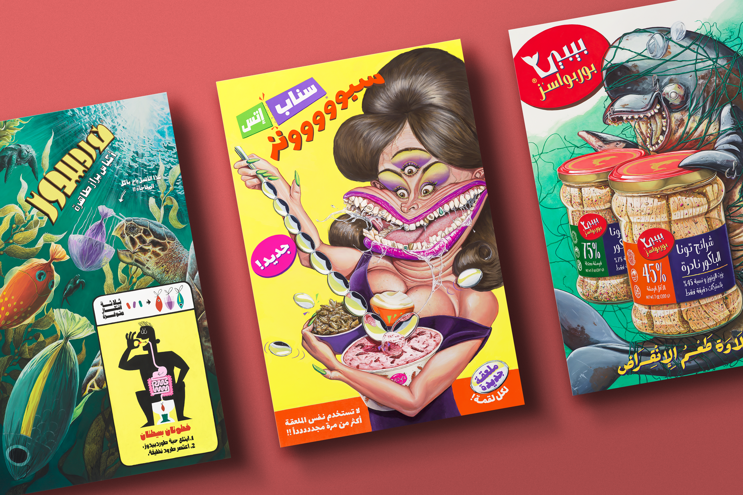
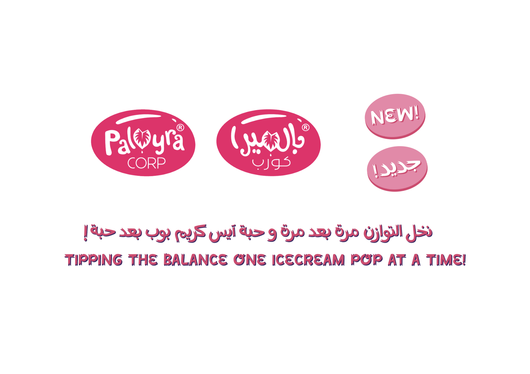
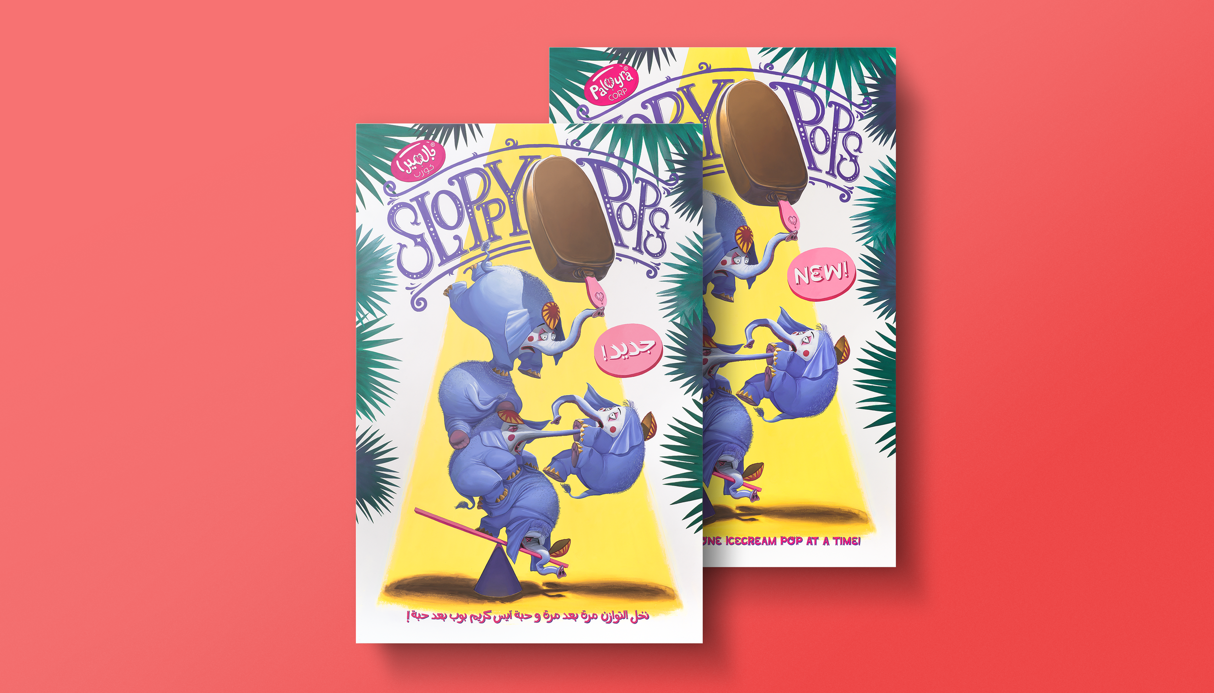
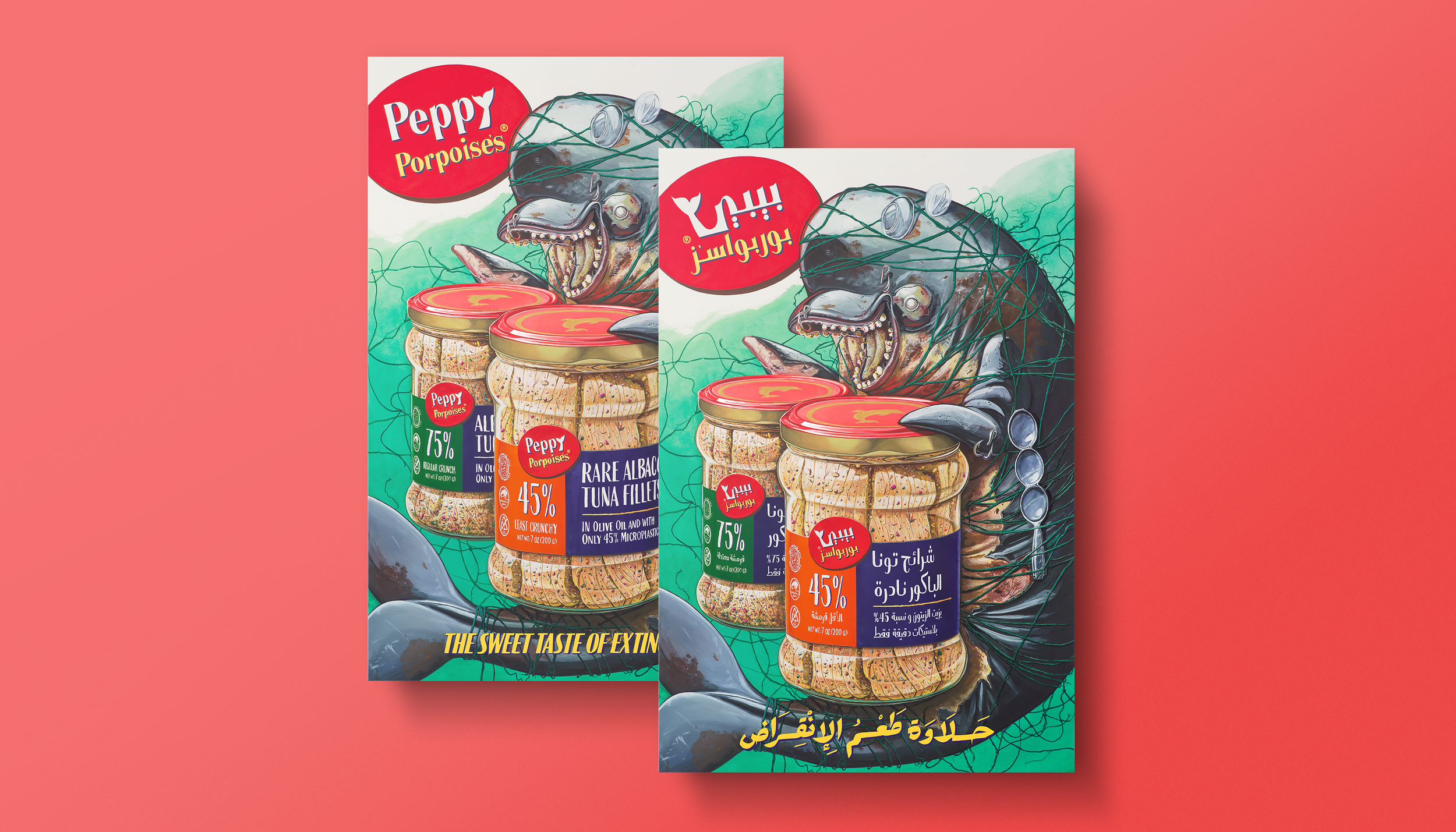
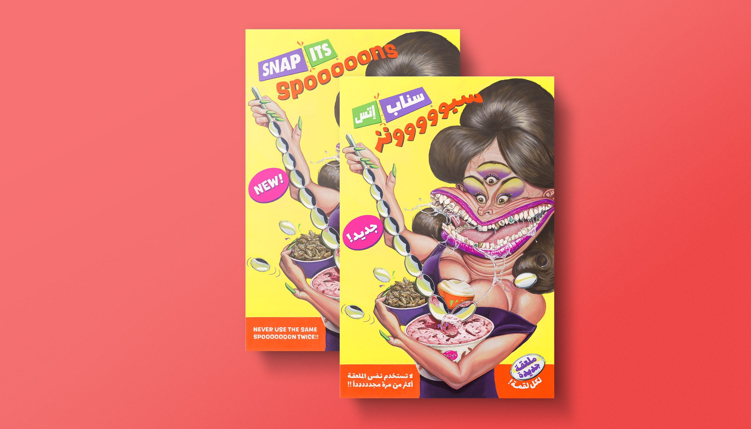
To create these art prints, the original paintings were meticulously photographed, digitized, and color corrected. Most of the text was translated into Arabic and designed to carry the same visual language.
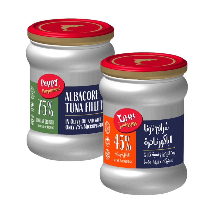
The Arabic typography was hand-drawn in ink on paper and then retouched to maintain the subtle hand drawn imperfections consistent with the original style of the paintings. These refined elements were used to produce a series of high-quality art prints, which are carefully packaged and presented in a custom-designed box.

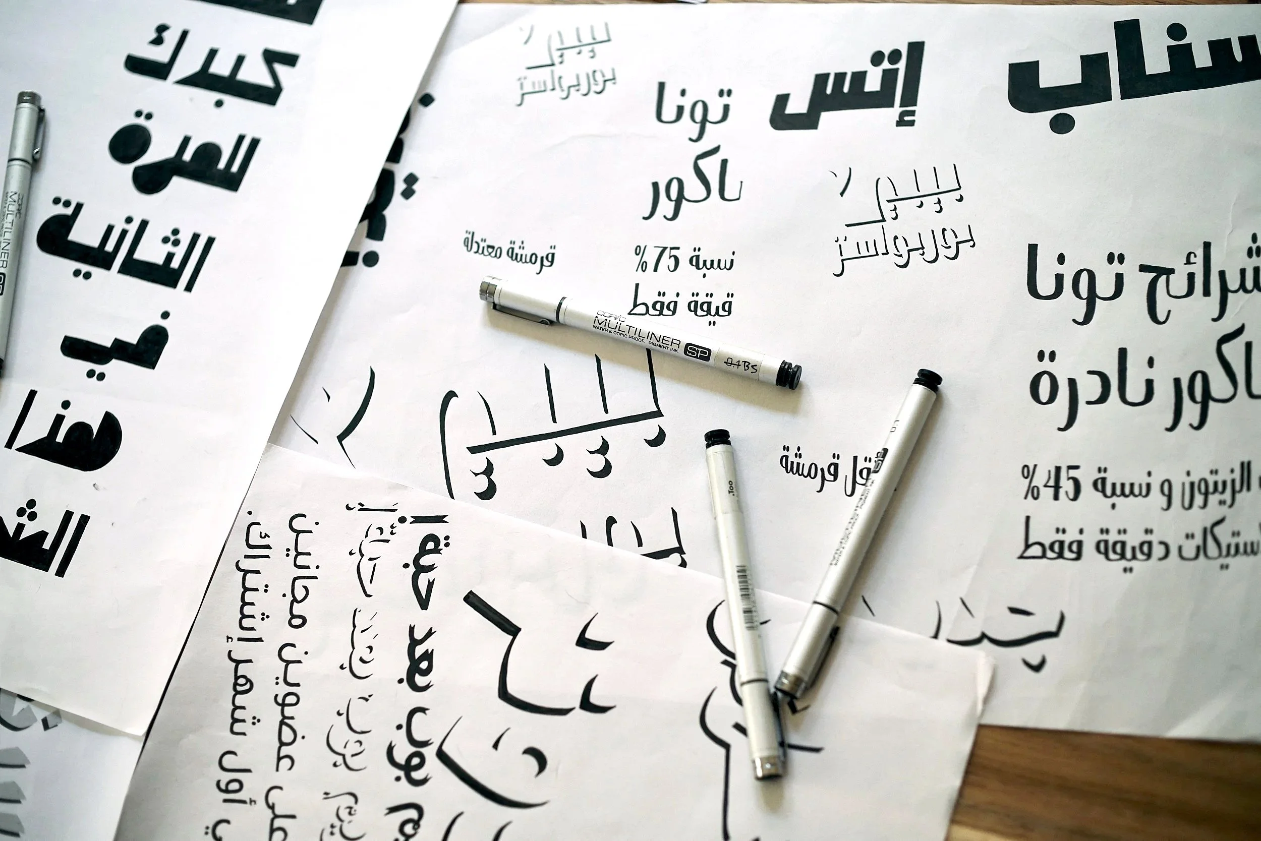
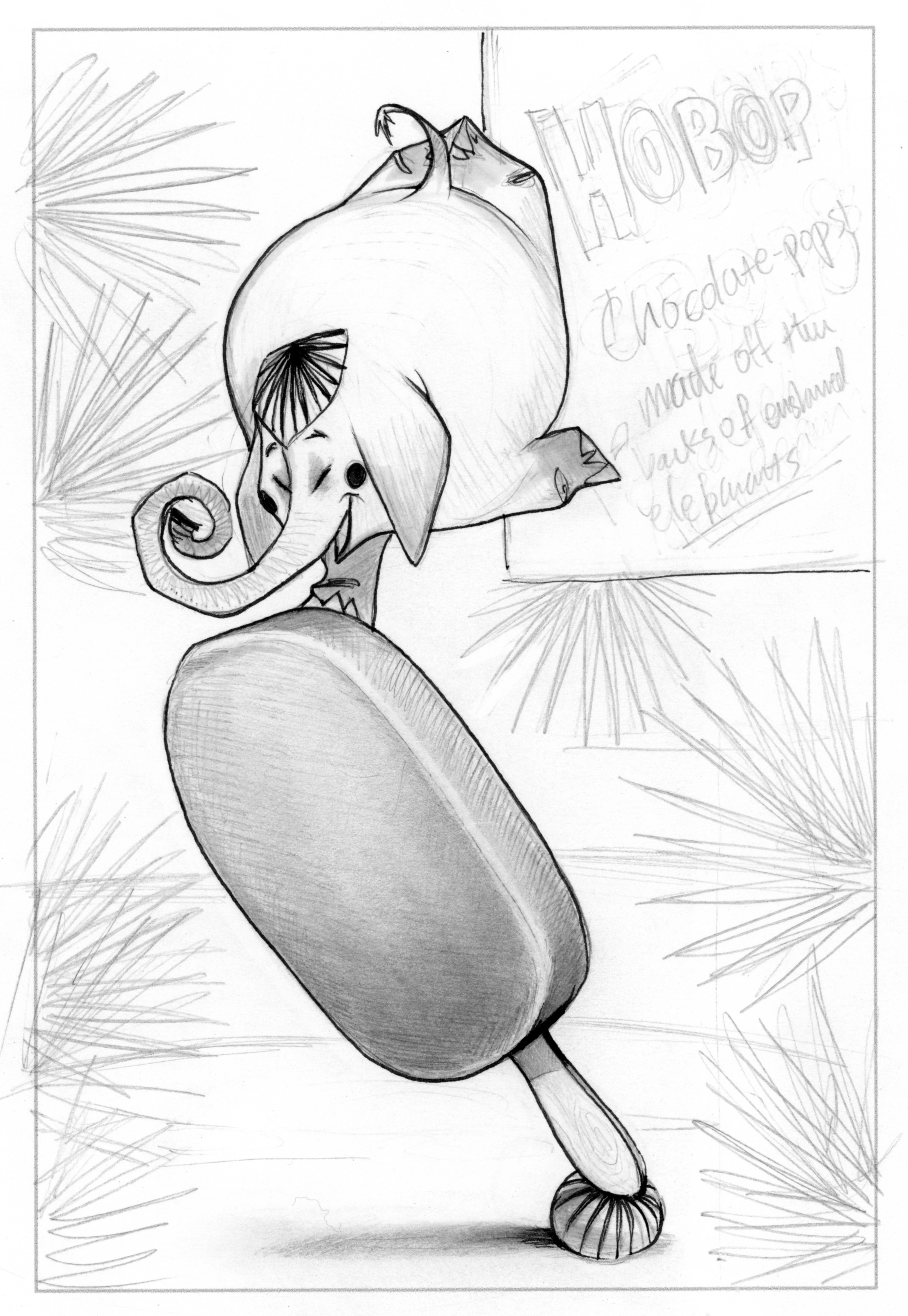
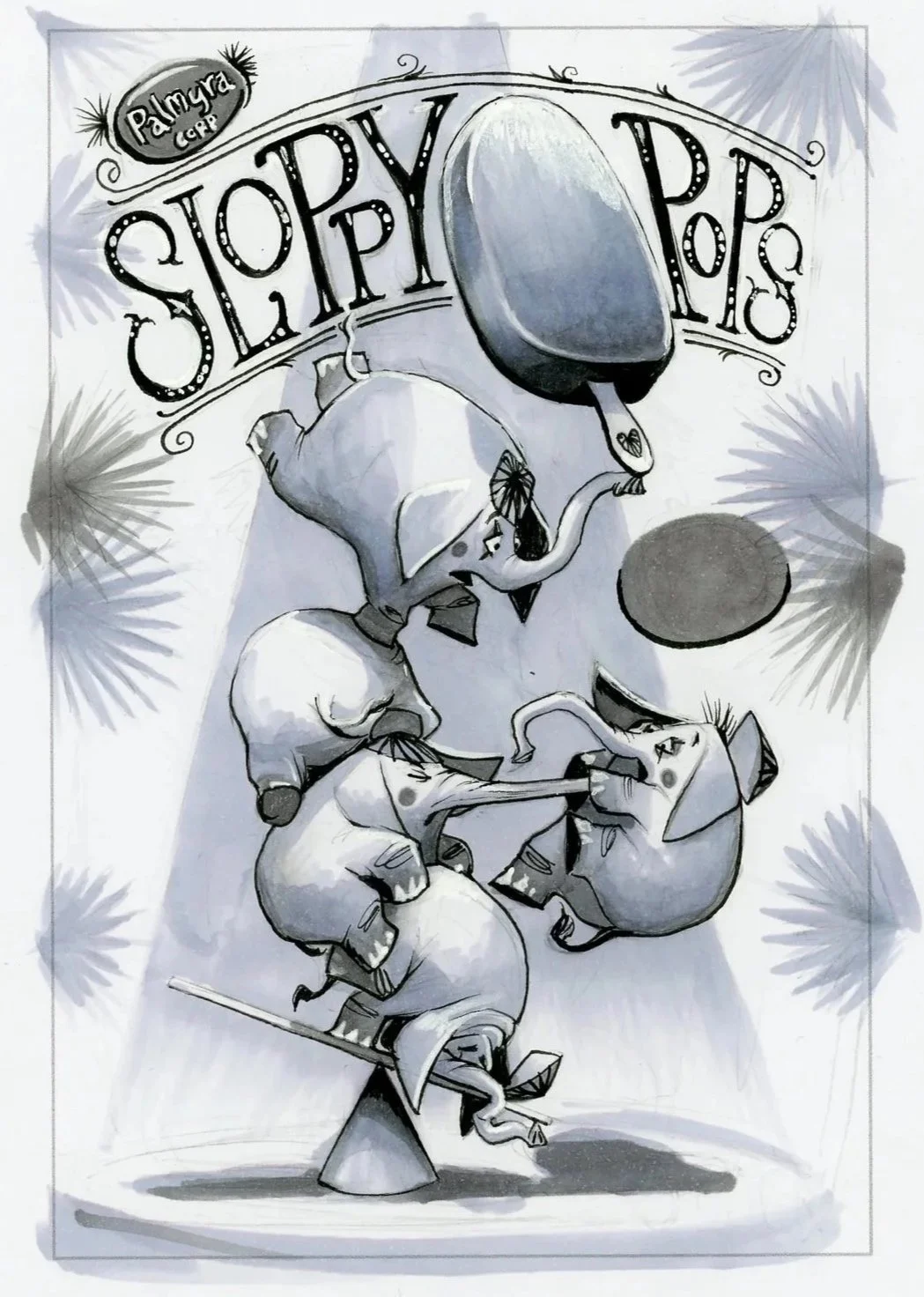
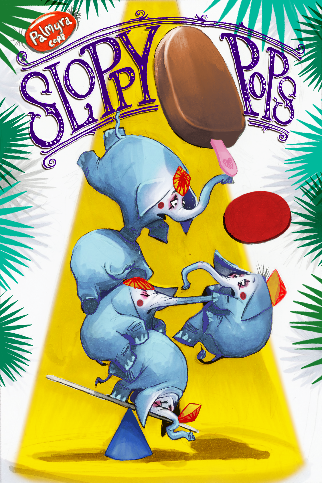
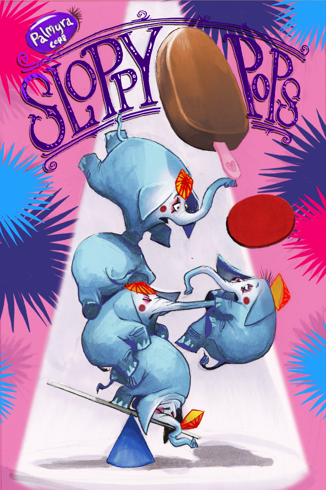
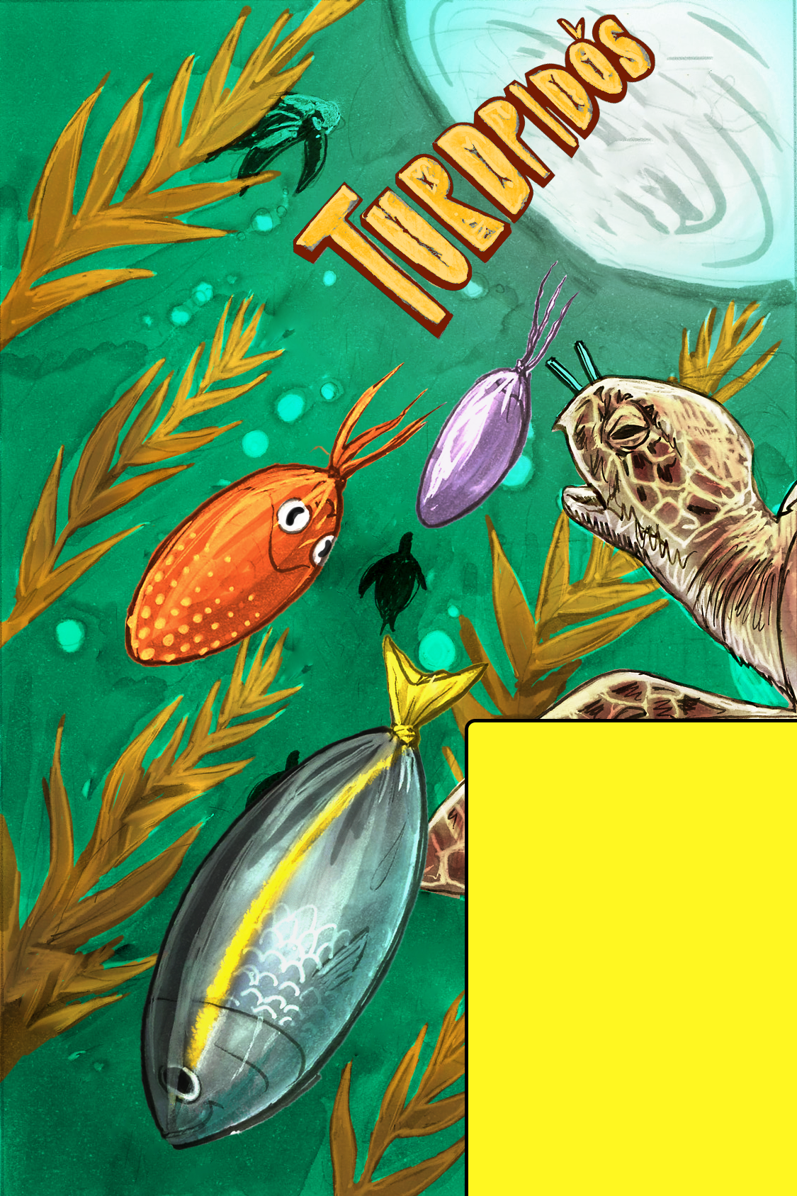
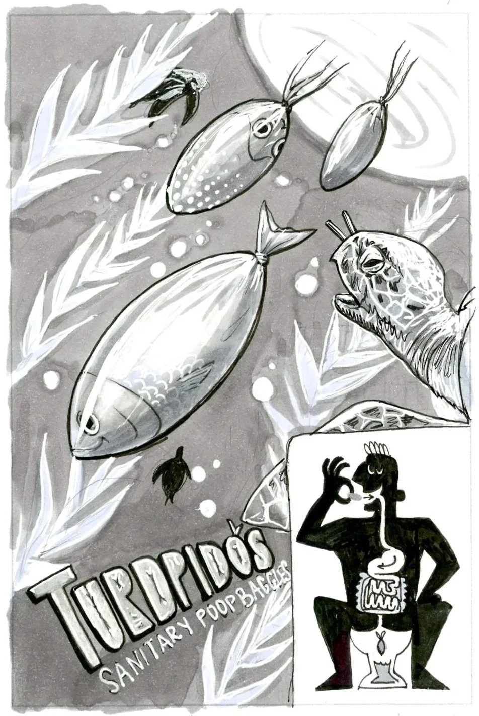
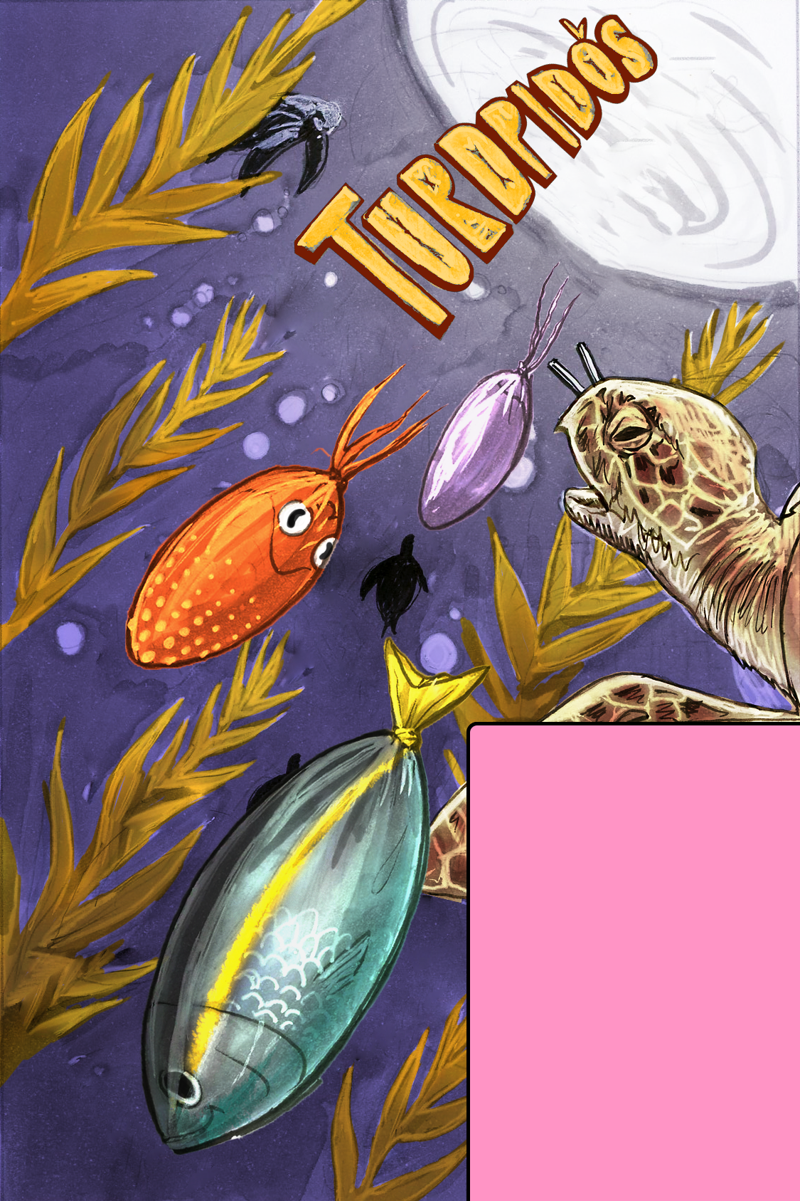
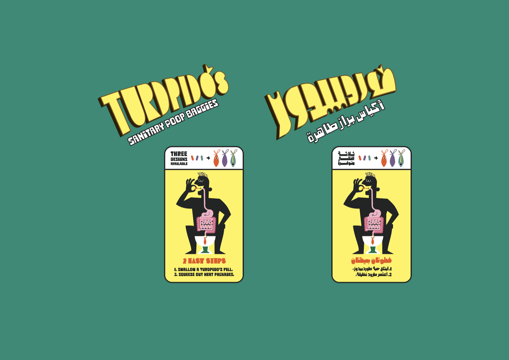
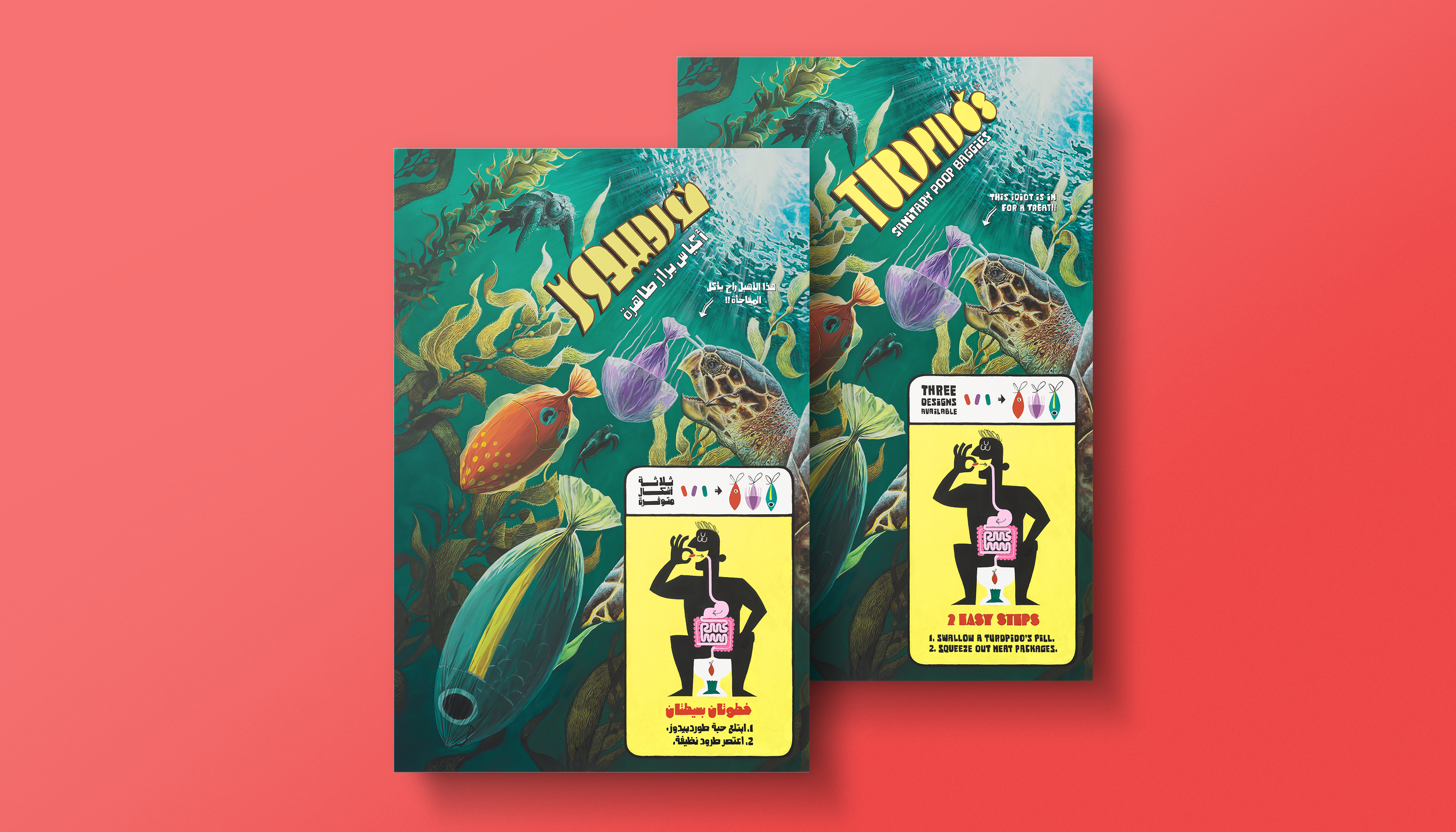
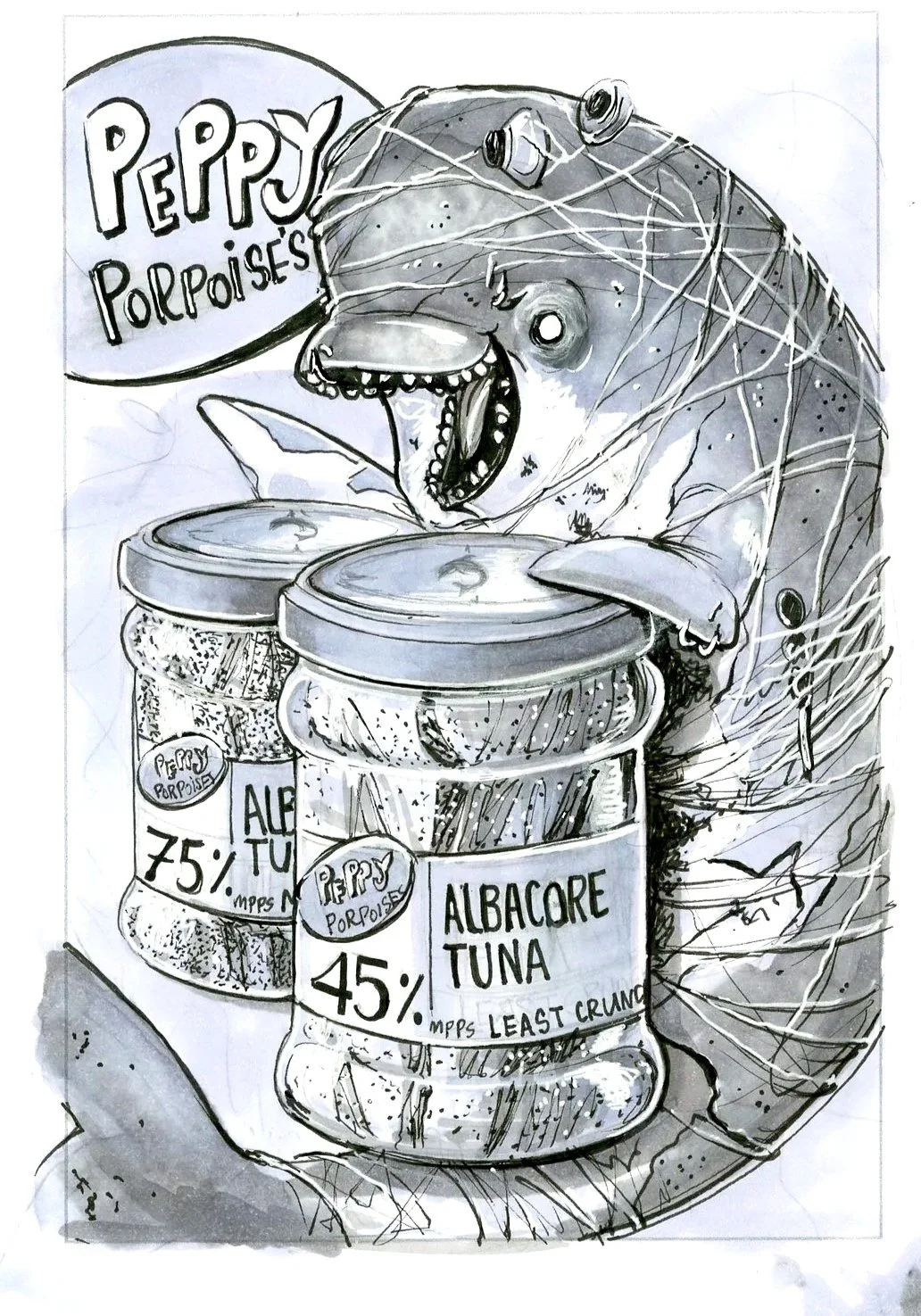
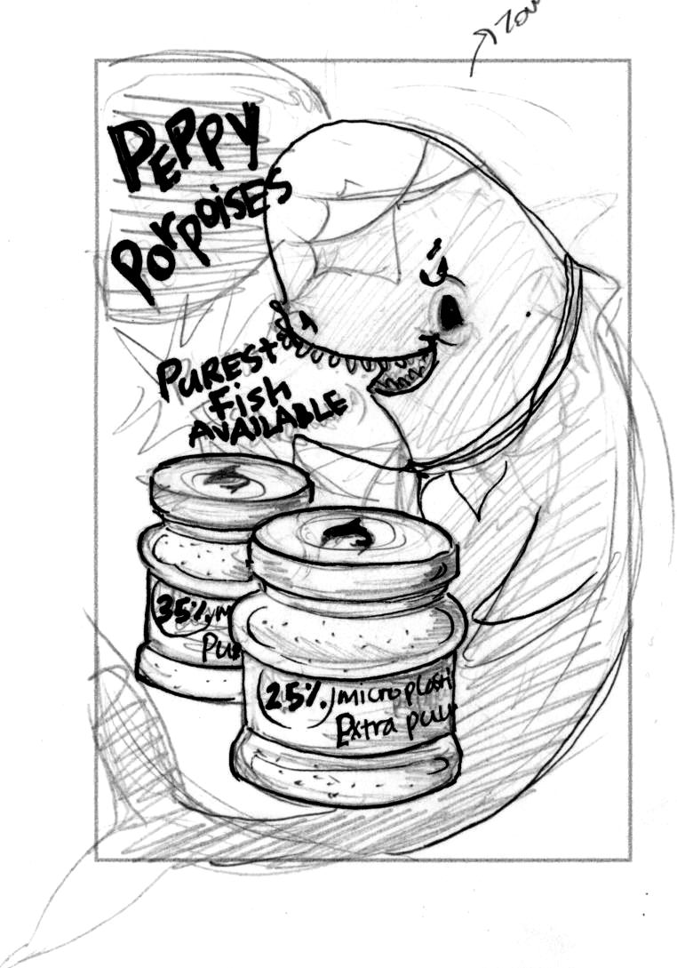
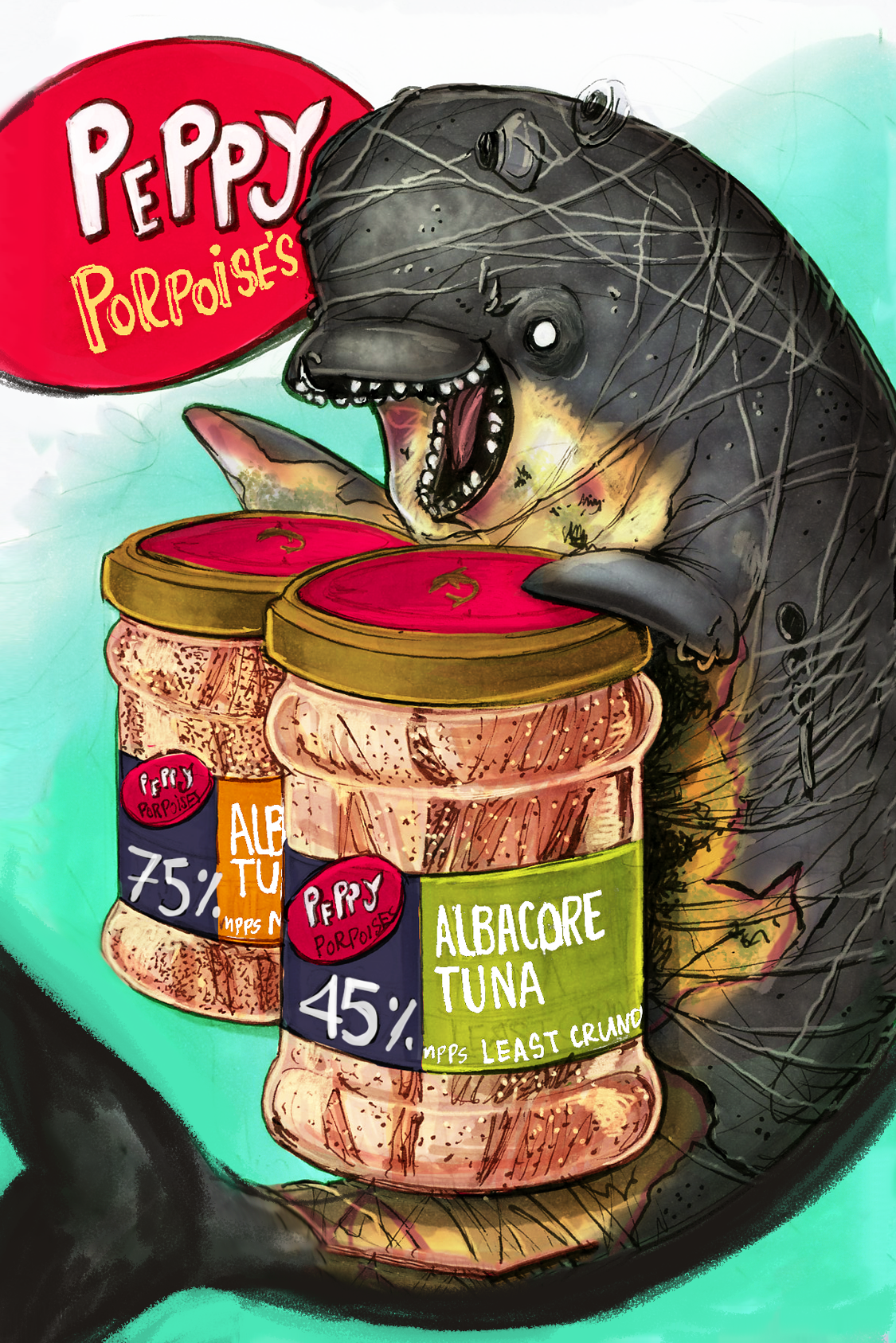
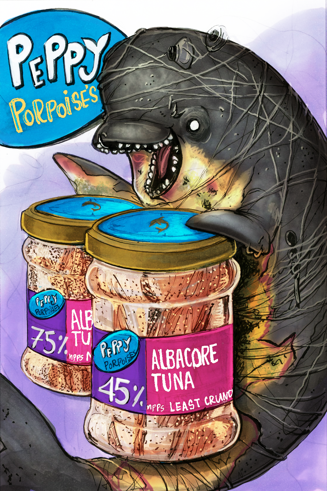
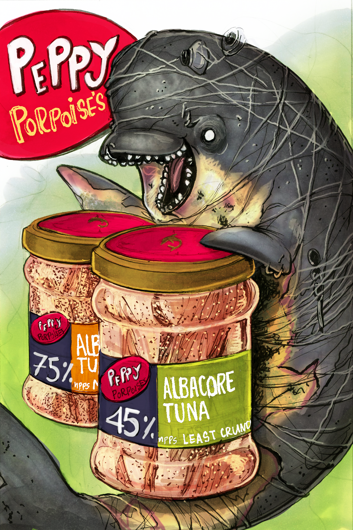
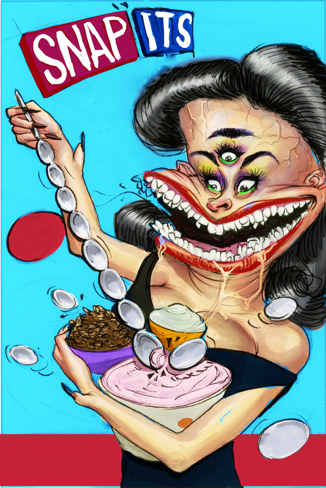
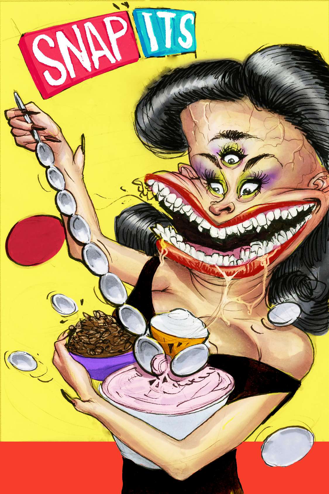
Each section below documents the design process from conception to execution: sketches, color studies, logo design, typography, label development, and the final Arabic-translated art print displayed alongside the original English gouache painting. Click the link to view the original (Non-)Perishable series and learn more.
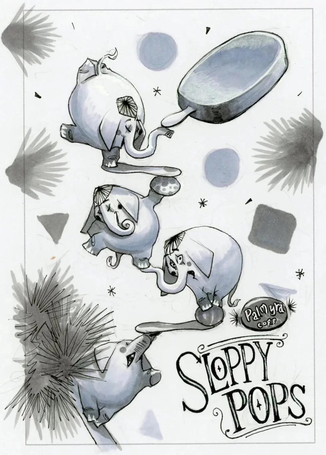
Sloppy Pops
Design • Illustration • AR Typography
Turdpido’s
Design • Illustration • AR Typography
Peppy Porpoise’s

Design • Branding • AR Typography
Snap Its Spooooons
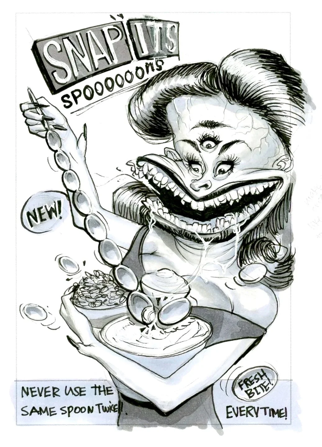
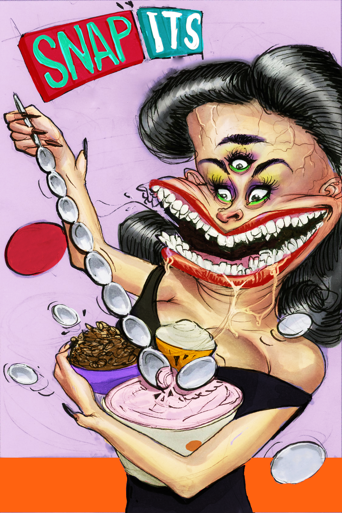
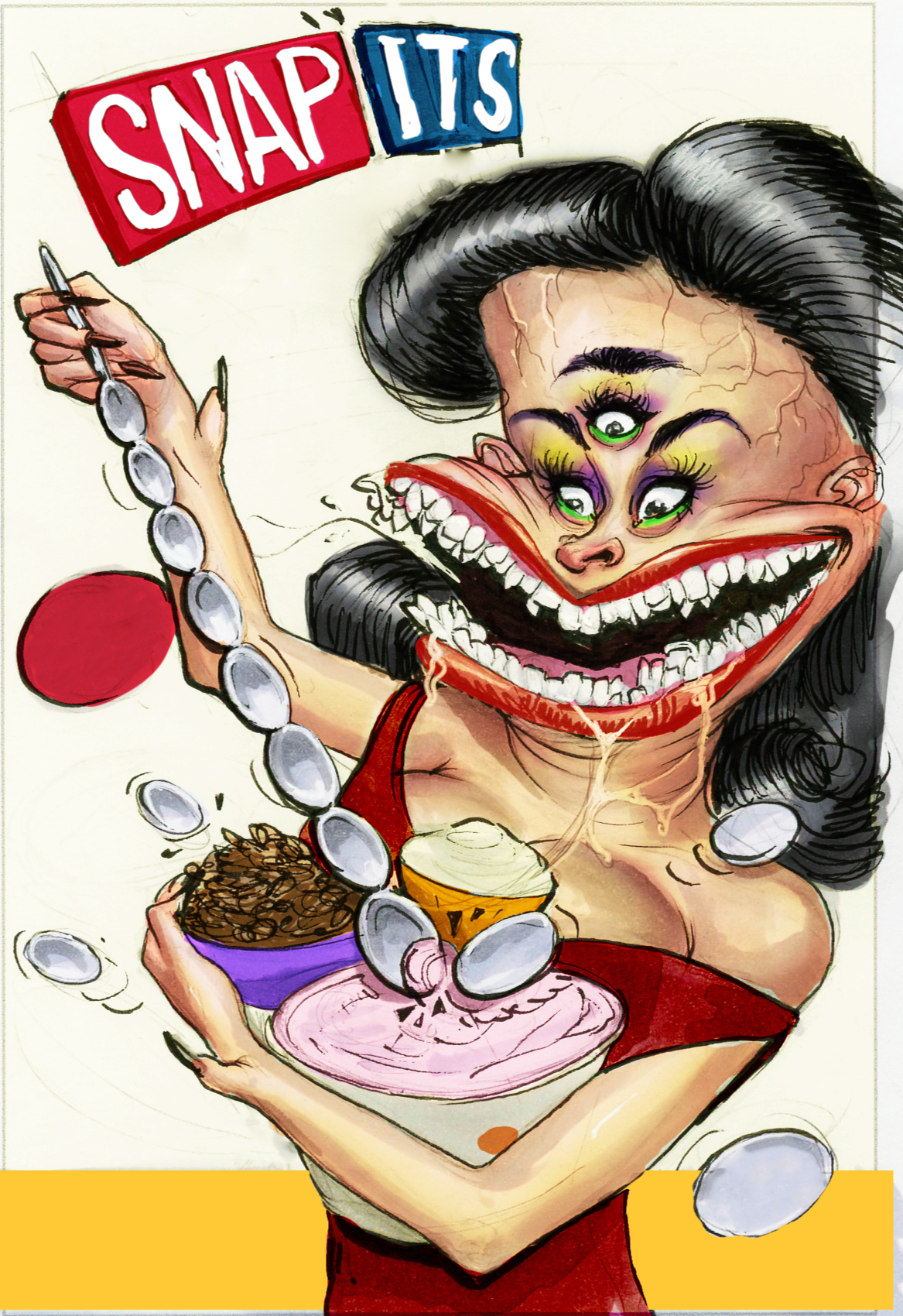

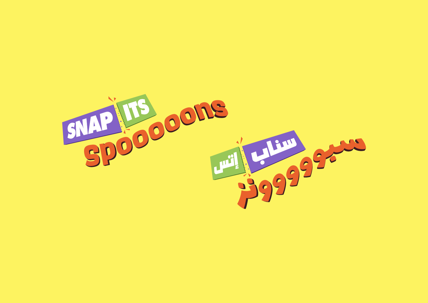
Design • Illustration • AR Typography
ARK Technologies
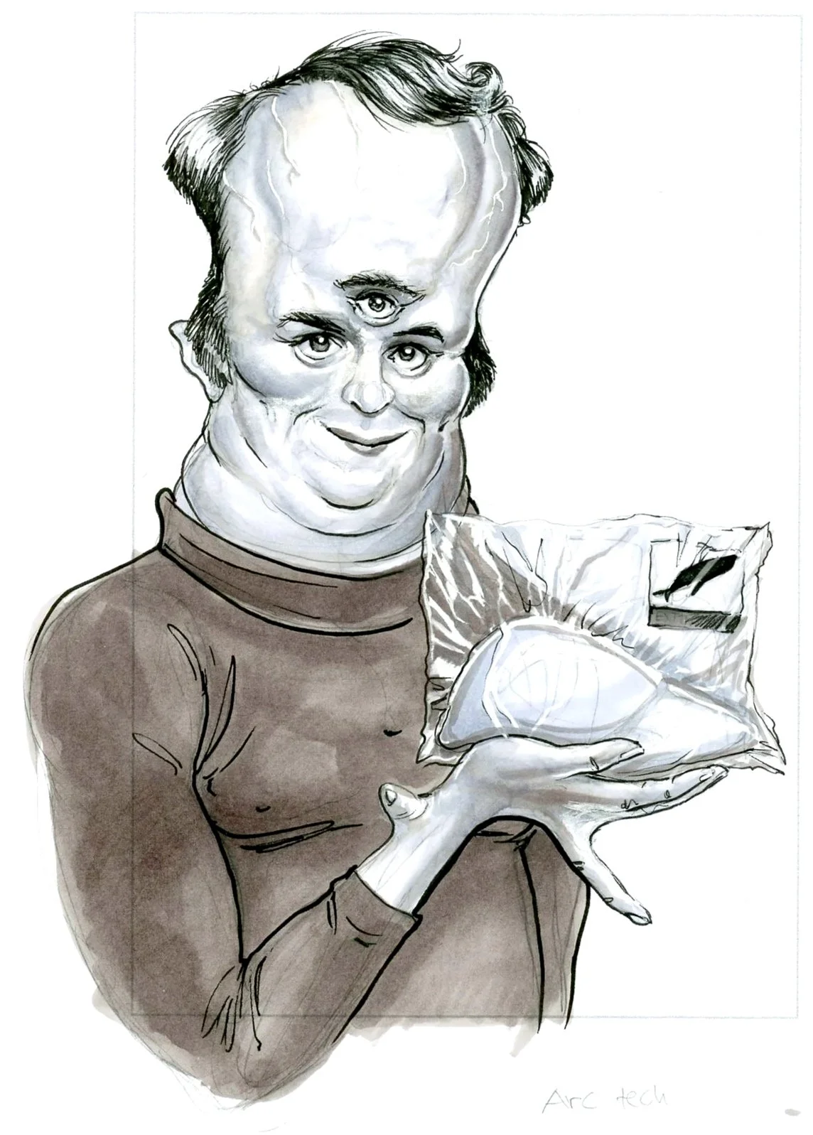
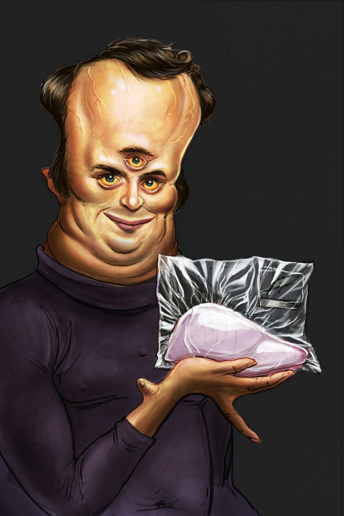
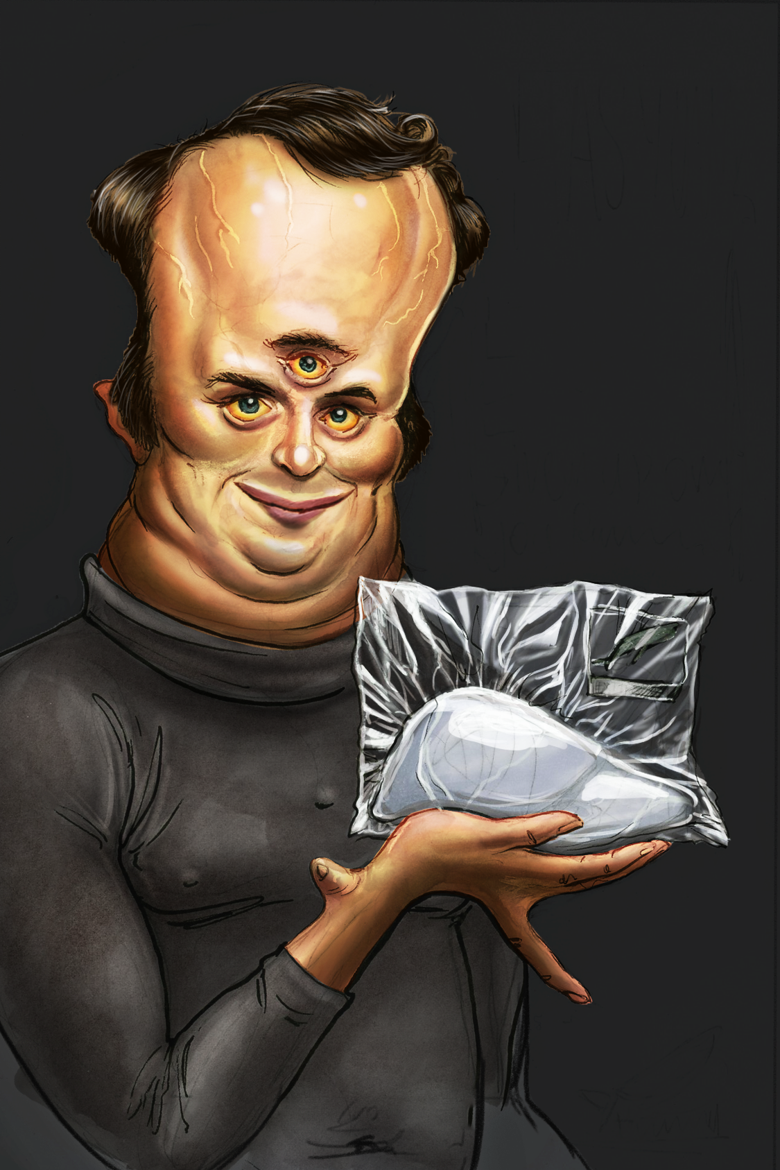
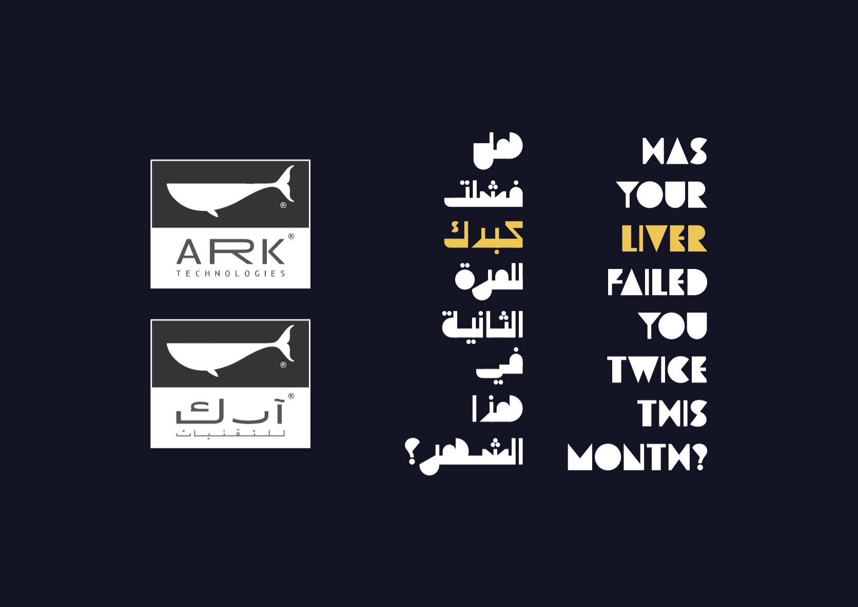
Design • Illustration • AR Typography