2023
Design • Art Direction • Branding • Naming


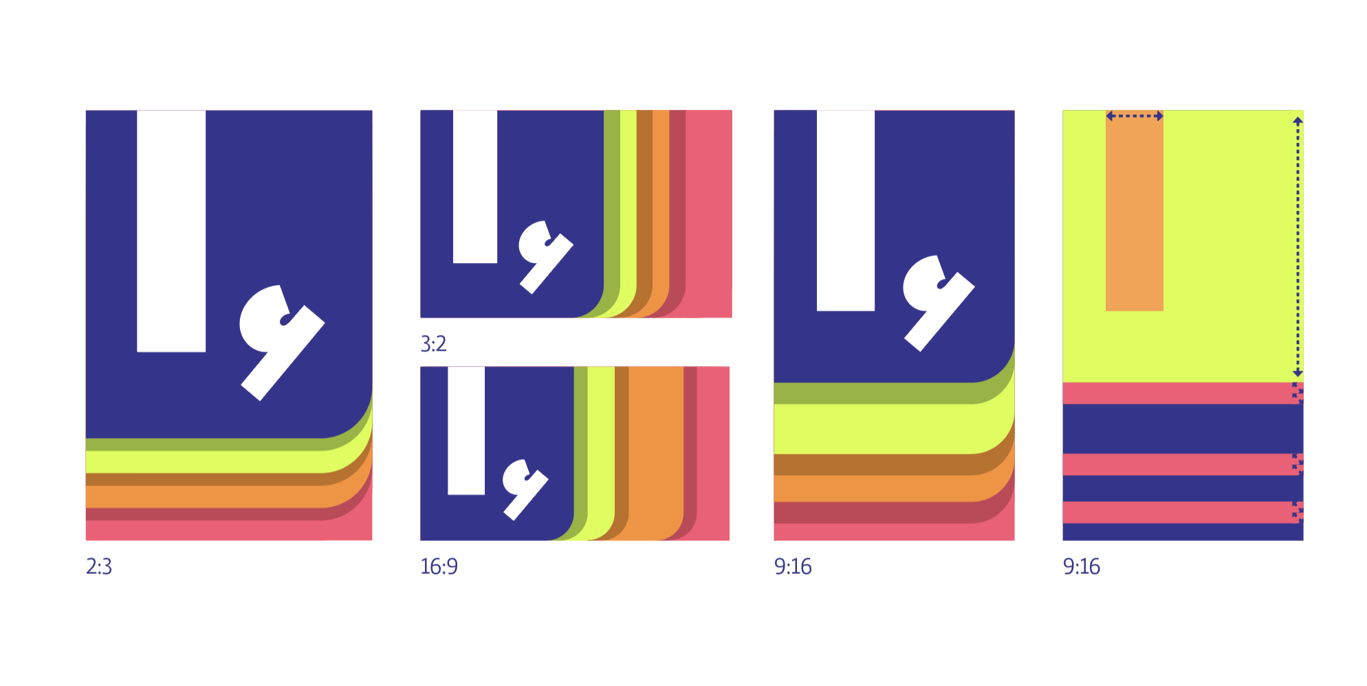
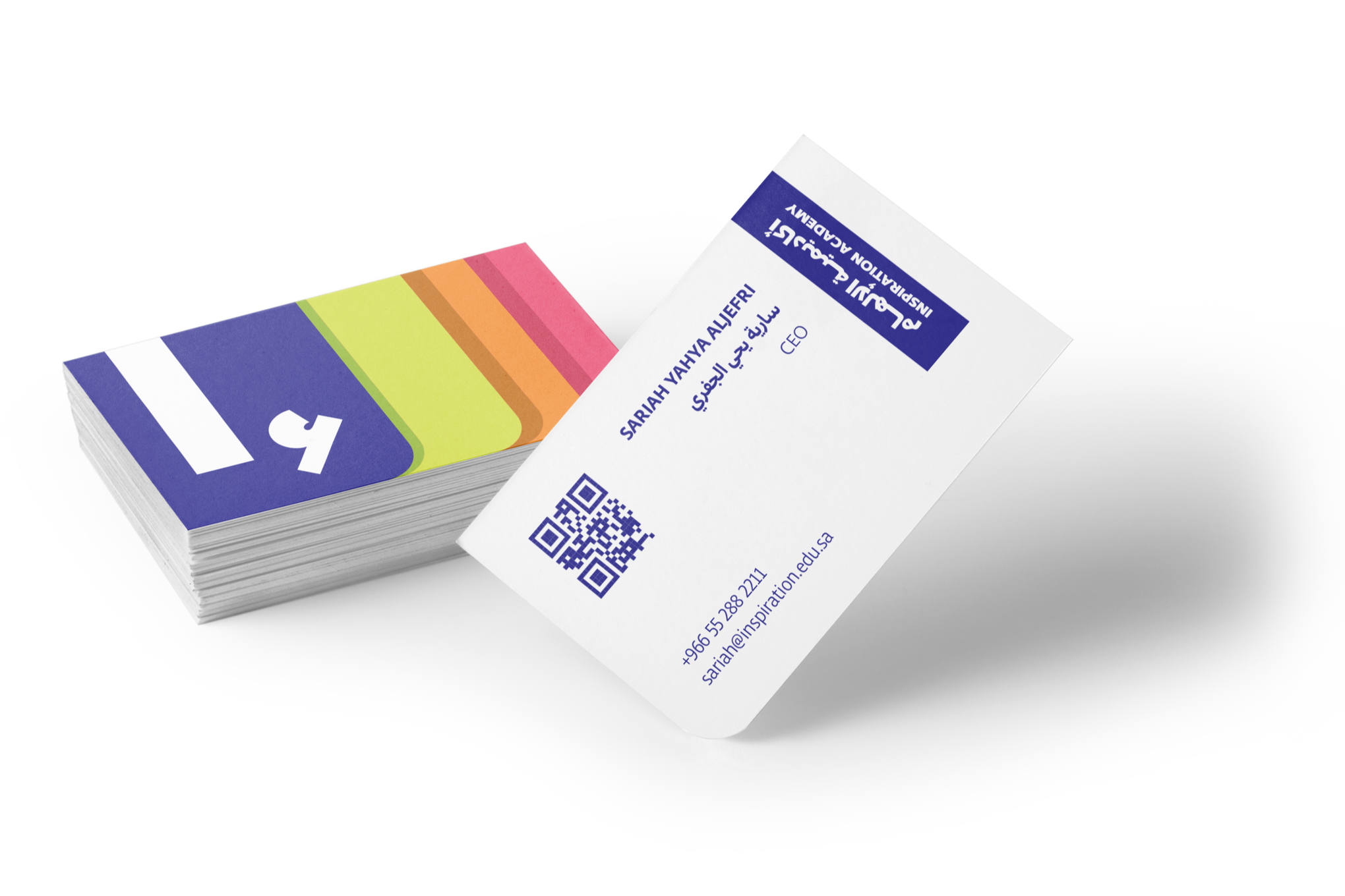
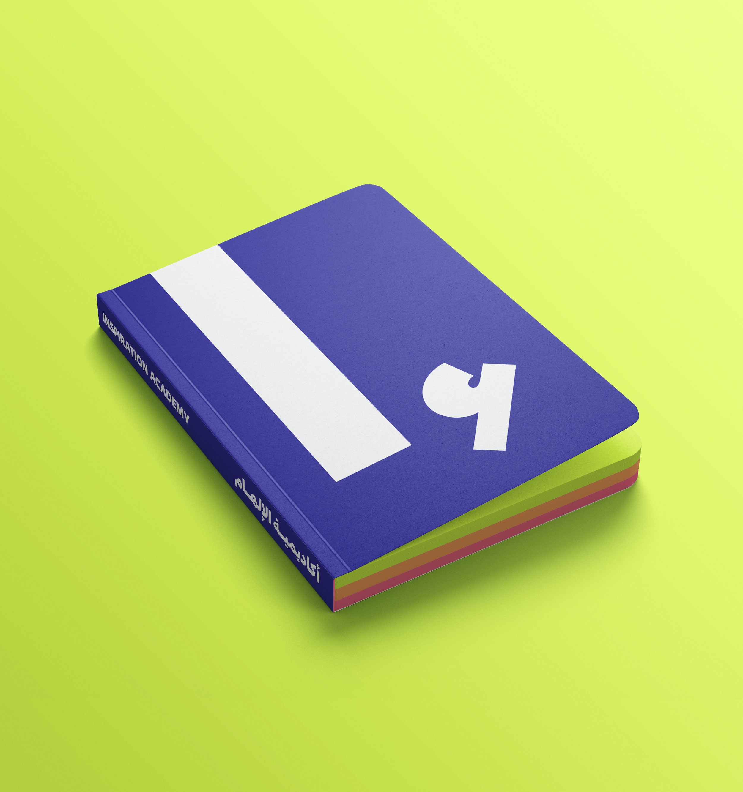
The graphic mark takes inspiration from the corner of a book, where the front cover signifies a new beginning and the colorful pages behind represent elementary, middle, and high school. These vibrant pages reflect the diversity of students and their varied interests, while the absence of a bookend suggests that the journey is ongoing, with limitless possibilities ahead. Together, these elements encapsulate Inspiration Academy’s commitment to empowering students to explore, engage, and shape their own futures.



Inspiration Academy believes that growth thrives through exploration and connection. Its visual identity reflects this through a mark that embodies diversity, knowledge, and endless potential. The “I” in “Inspiration” aligns with the “إ” in “إﻟﻬﺎم” and the Roman numeral “i,” highlighting the connection between languages and cultures. The comma beside the “I” symbolizes a bridge between past, present, and future — representing continuous learning and active engagement. Just as an individual thrives within a community, the “I” is always accompanied by the comma, reflecting the academy’s focus on collaboration and participation. (أ) echoing the Aleph ,(ء) The inclusion of the Hamzah connects the design to the foundation of language and communication, reinforcing the academy’s mission to cultivate curiosity, adaptability, and self-expression.
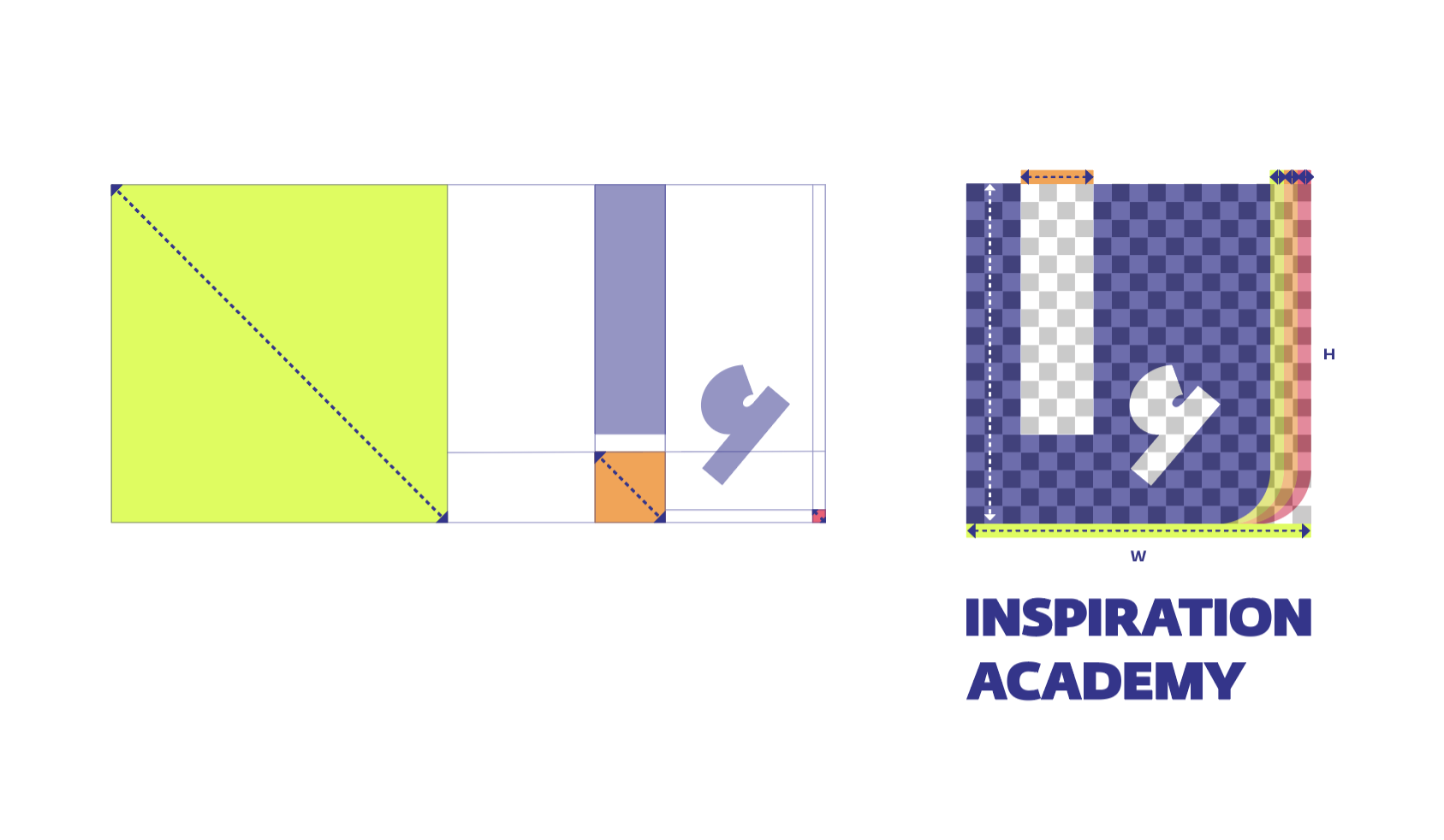
Three measurement units are abstracted from the graphic mark: the overall size of the graphic mark, the width of the I, and the width of the individual pages on the right side of the graphic mark. Throughout branded materials, spacing is guided by the ratio of these elements in relation to one another.