2023
Design • Art Direction • Branding
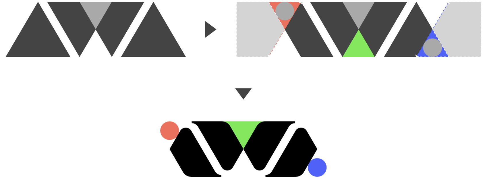
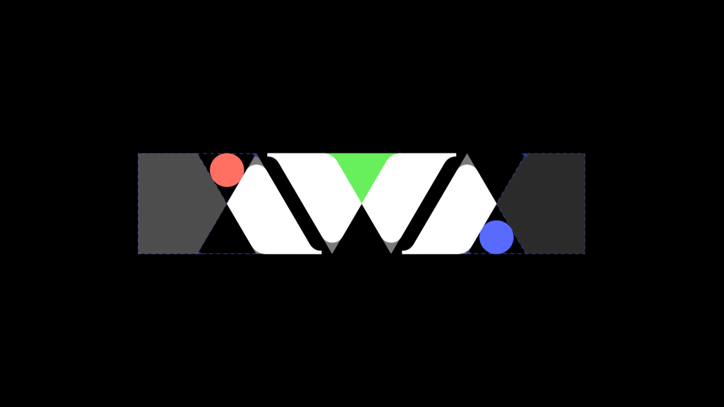
Inspiration World Academy (IWA) is represented by a typographic logo that draws inspiration from the properties of light, symbolizing the interplay between the visible and invisible. The mark embodies themes of enlightenment and multiplicity, reflecting IWA’s core values of creativity and entrepreneurial initiative. The design cleverly balances form and meaning — resembling both an inverted prism and the letter “W,” while the two circles on either end signify a beginning and an end. The negative space between the I, W, and A mirrors the pattern of a light wavelength, reinforcing the concept of illumination and discovery.
Much like a prism, IWA nurtures individual growth while fostering active, community-minded awareness and engagement. The student, like a ray of light, enters IWA and emerges as a multifaceted, well-rounded individual, equipped with a versatile skill set that adapts to any environment. At the same time, the academy itself acts as the prism, empowering students from diverse backgrounds to chart their own paths, ultimately transforming their potential into a vibrant spectrum of possibilities.

The color palette references the RGB (Red, Green, Blue) spectrum, evoking the essence of synthetic light and its limitless combinations, symbolizing the diversity and creativity nurtured within the academy. To ensure balance and harmony, the shapes of the I, A, and the two halves of the W are identical, creating a cohesive structure. For enhanced legibility and sophistication, the letters were refined with serifs, adding a sense of clarity and precision. This thoughtful design results in a logo that is visually striking and conceptually rich, seamlessly aligning with IWA’s mission to inspire and illuminate.